

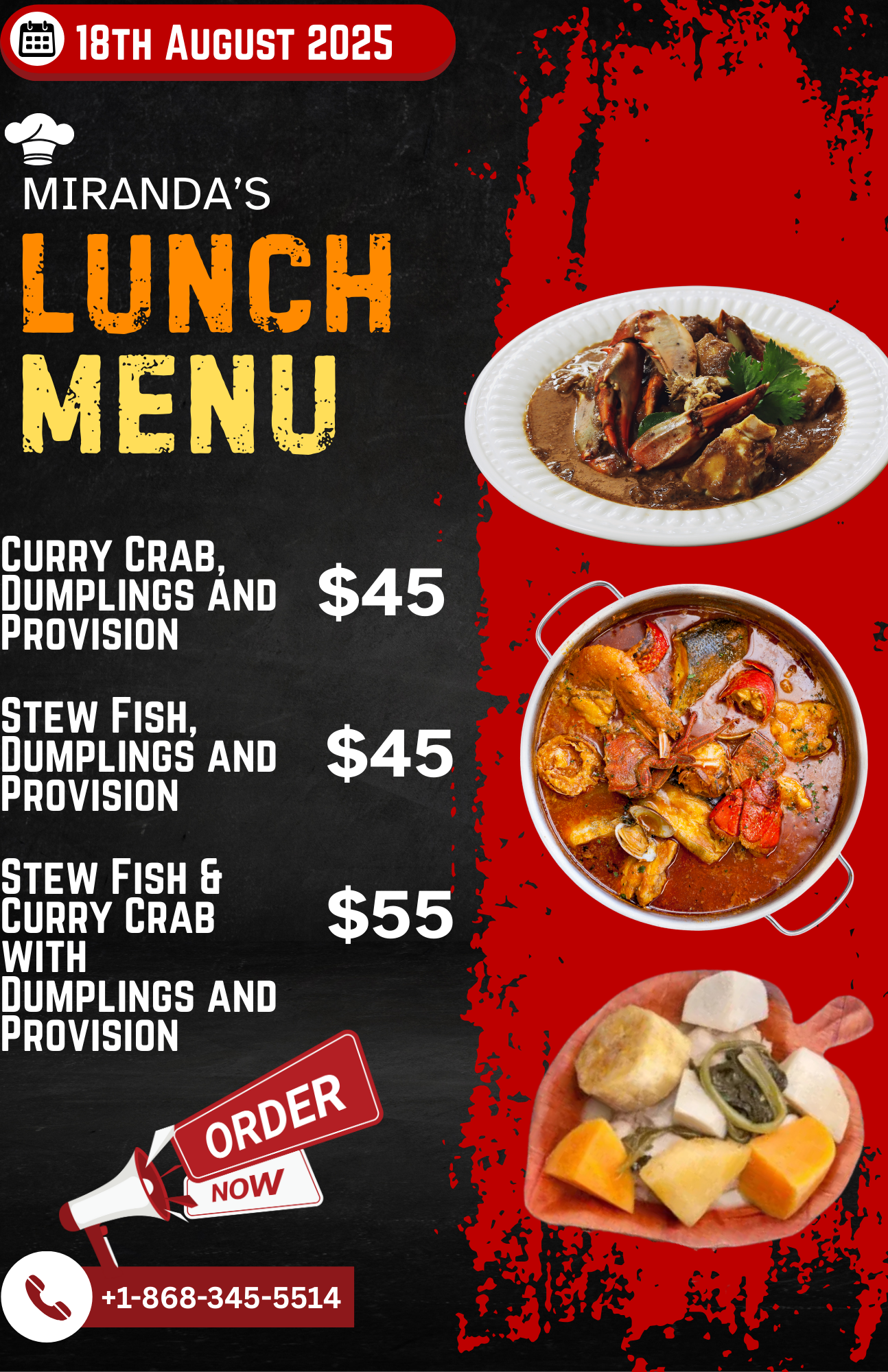
Your flyer has seven fonts. The price is still missing.
There is a headline, a logo, three photos and a list of everything the business has ever offered. Somewhere in there is the thing you wanted people to buy.
Key takeaways
- One clear offer beats a crowded layout.
- Provide prices, dates and ordering details early.
- Check the final size, not just the design preview.
Write the offer before opening the design file
Tell your designer who the graphic is for, what you are offering, the required details, the action you want, where it will appear and when it is needed.
For a lunch menu, that means dishes, prices, availability and ordering details. IXM's Miranda's menu work, shown above, has that practical job: help someone choose and order.
Give the important details room
If everything is bold, nothing tells the reader where to start. Choose one main message, then give the supporting details enough space to be readable.
Use your existing brand colours and fonts. A new promotion does not need a new identity. It needs an offer people can understand.
Approve it at the size people will see
View the social graphic on a phone. Check whether a preview crop hides the price or contact number. For print, agree on dimensions, margins and file requirements with the printer.
Read the dates and prices one last time. It is much cheaper to spot a typo before a print run than after the flyers arrive.
Quick audit
- Is the offer understandable at a glance?
- Are prices, dates and contact details correct?
- Does the mobile crop preserve key information?
- Has the printer confirmed the required format?