

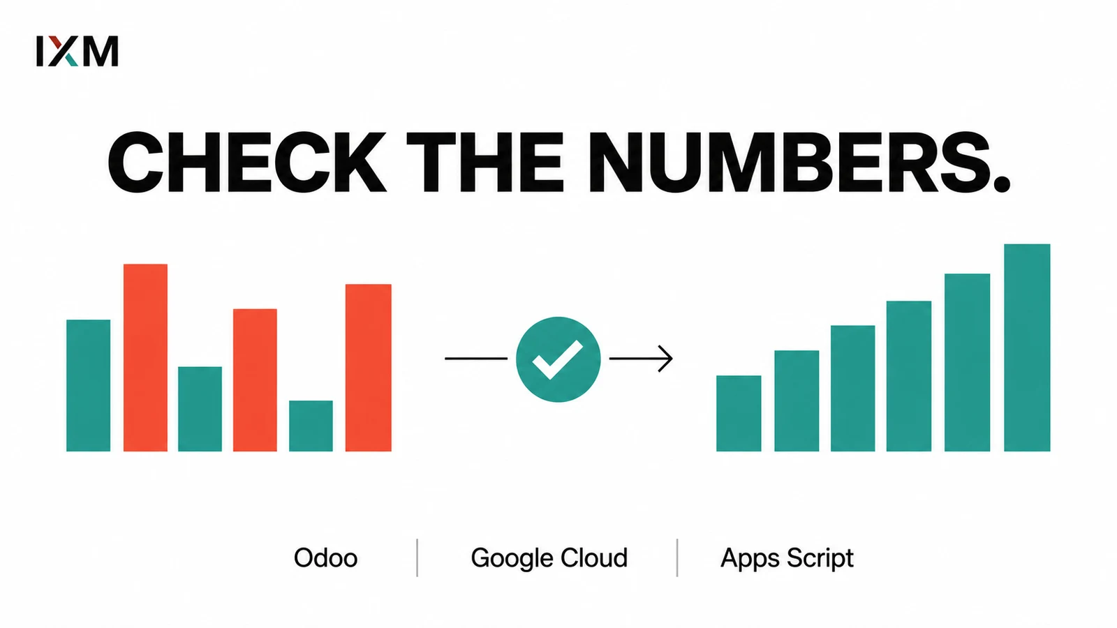
A dashboard can make bad data look very expensive.
Beautiful charts. Confident numbers. Completely different totals from the finance team. A dashboard makes information easier to see. It doesn't automatically make it trustworthy.
Key takeaways
- Agree on what each number means.
- Show the source and last successful refresh.
- Reconcile totals before relying on charts.
Settle the argument before drawing the chart
What counts as a sale? Are cancelled jobs included? Did that record arrive twice? Are both teams looking at the same date range?
A dashboard cannot settle those questions for you. Skip them and you may end up making faster decisions from worse information.
Connect the work behind the numbers
IXM's Spartan Home Pros operations work spans Odoo, Zapier, Google Cloud, Apps Script, custom dashboards, and customer portal logic. Connecting the tools is part of making activity visible across the business.
When building a dashboard that combines multiple software systems, define the source for each figure and show when it last updated. A failed refresh should not look like a quiet day.
Start with one disputed number
For businesses in Trinidad and Tobago, a useful dashboard project can start with a single question the team struggles to answer. Trace the underlying records, agree on the definition, then build the view.
The visual polish matters. So does being able to explain the total.
Quick audit
- Do teams use the same definition and date range?
- Can you trace a total to its source records?
- Is a stale or failed refresh obvious?